How To Use
Learn how to use the Block Farm Editor for Umbraco. This guide covers initial setup, backoffice configuration, building your first block, and defining block properties.
Initial setup.
Setup is comprised of the following steps:
Install the Block Farm Editor nuget package
dotnet add package BlockFarmEditor.UmbracoInitial setup in your Umbraco project:
Add AddBlockFarmEditor() to your builder.CreateUmbracoBuilder()
builder.CreateUmbracoBuilder()
    .AddBackOffice()
    .AddWebsite()
    .AddComposers()
    .AddBlockFarmEditor() // Added BlockFarmEditor
    .Build();
Add the tag helper import to your _ViewImports.cshtml file.
@addTagHelper *, BlockFarmEditor.UmbracoAdd the register tag helper <register-block-farm></register-block-farm> to your umbraco layout’s head section. This tag helper registers the front end javascript needed when in edit mode.
<html>
   <head>
       <register-block-farm></register-block-farm>
   </head>
   <body>
   </body>
</html>
The javascript will not be loaded in live mode only in edit mode.
Backoffice setup:
Create your first Block Area
Block Areas are used to define where blocks can be placed in your templates. Use the <block-area> tag helper to define block areas in your templates.
Example:
@using Umbraco.Cms.Web.Common.PublishedModels;
@inherits Umbraco.Cms.Web.Common.Views.UmbracoViewPage
@{
	Layout = "layout.cshtml";
}

<block-area identifier="banner"></block-area>

<div class="container-fluid">
    <div class="row mb-3">
        <div class="col-12 col-md-3">
            <block-area identifier="sidebar-widgets"></block-area>
        </div>

        <div class="col-12 col-md-9">
            <block-area identifier="main"></block-area>
        </div>
    </div>
    <block-area identifier="full-page"></block-area>
</div>
Limit available blocks for selection.
Pass an IEnumerable<string> to allowed-blocks to limit the types available for selection on that specific block.
@{
    IEnumerable<string> allowedBlocks = ["blockfarmeditor.bootstrap-row"];
}
<div class="main-content">
    <block-area identifier="container" allowed-blocks="@allowedBlocks"></block-area>
</div>
Build your first block.
Blocks are reusable components geared towards easily place content in different areas in your templates. They can be used to create anything from simple text blocks to complex components with multiple properties and behaviors.
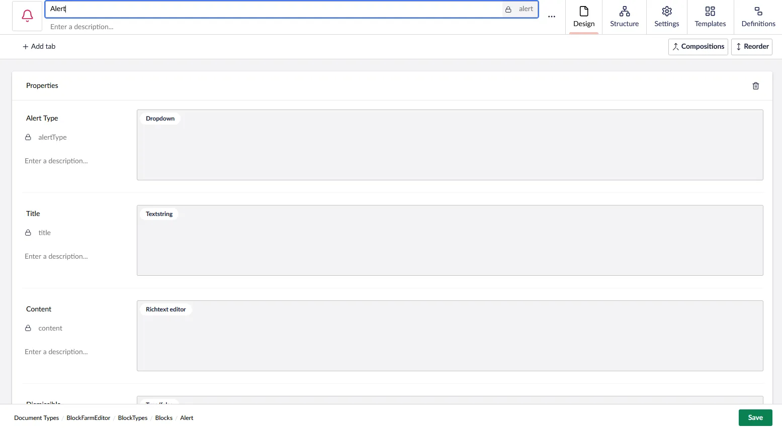
Build the Element Type
The intial properties of the block are built out using Umbraco DataTypes just like any other Umbraco Document Type.
Create the Partial View
Create a partial view with which to display the properties. You can use standard Umbraco Syntax including the Models Builder.
@{
    var alertClass = $"alert alert-{Model.AlertType}";
    if (Model.Dismissible)
    {
        alertClass += " alert-dismissible fade show";
    }
}

<div class="@alertClass" role="alert">
    @if (!string.IsNullOrWhiteSpace(Model.Title))
    {
        <h4 class="alert-heading">@Model.Title</h4>
    }
    @Html.Raw(Model.Content)
    @if (Model.Dismissible)
    {
        <button type="button" class="btn-close" data-bs-dismiss="alert" aria-label="Close"></button>
    }
</div>
Optional ViewComponent Assembly Attribute
If you prefer to use a viewcomponent for your display vs a direct partial view, use the [assembly: BlockFarmEditorDefinition("alert", ViewComponentType = typeof(AlertViewComponent))] assembly attribute. The first parameter “alert” would be the alias of the block. The Models Builder model of the element type of the block, will be passed into the ViewComponent via the properties parameter.
[assembly: BlockFarmEditorDefinition("alert", ViewComponentType = typeof(AlertViewComponent))]

public class AlertViewComponent : ViewComponent
{
    public async Task<IViewComponentResult> InvokeAsync(Alert properties)
    {
        // Do whatever dyanmic retieval you need here
        return View("AlertView", properties);
    }
}
Setup the Block Definition
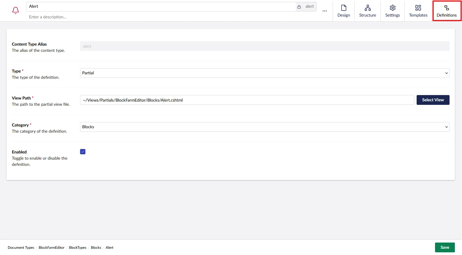
Go back to the Block’s Element Type. Switch to the Definition tab in order to setup the Block Definition. This is what will allow the Element Type to be selectedable as visual block.
Defining Custom Block Property Configs.
You are able to directly control the configuration passed into a DataType programatically.
- Use the
BlockFarmEditorConfigurationattribute to define the custom configuration for a property.
Adding a custom config to a property
Use a IBlockFarmEditorConfig to specify the property editor’s config on the backend.
[assembly: BlockFarmEditorConfiguration("badge", "badgeColor", typeof(BootstrapColorConfig))]

namespace MyNameSpace;

public class BootstrapColorConfig : IBlockFarmEditorConfig
{
    /// <summary>
    /// Returns a list of Bootstrap color options for dropdowns.
    /// This is used for various components like alerts, badges, buttons, etc.
    /// </summary>
    /// <returns></returns>
    public Task<IEnumerable<BlockFarmEditorConfigItem>> GetItems()
    {
        return
        Task.FromResult<IEnumerable<BlockFarmEditorConfigItem>>([
            new ()
                {
                    Alias = "items",
                    Value = new List<DropdownEditorConfigItem>() {
                        new("Primary", "primary"),
                        new("Secondary", "secondary"),
                        new("Success", "success"),
                        new("Danger", "danger"),
                        new("Warning", "warning"),
                        new("Info", "info"),
                        new("Light", "light"),
                        new("Dark", "dark"),
                        new("Link", "link")
                    }
                },
                new ()
                {
                    Alias = "multiple",
                    Value = false
                }
        ]);
    }
}
Dynamic Selection of content within a property.
Block Farm Editor is fully compatible with the Models Builder. This allows you to easily select dynamic content for display from the Properties Editor. Yeah can then use the Models Builder to display that content, or manually loop through the content as need be.