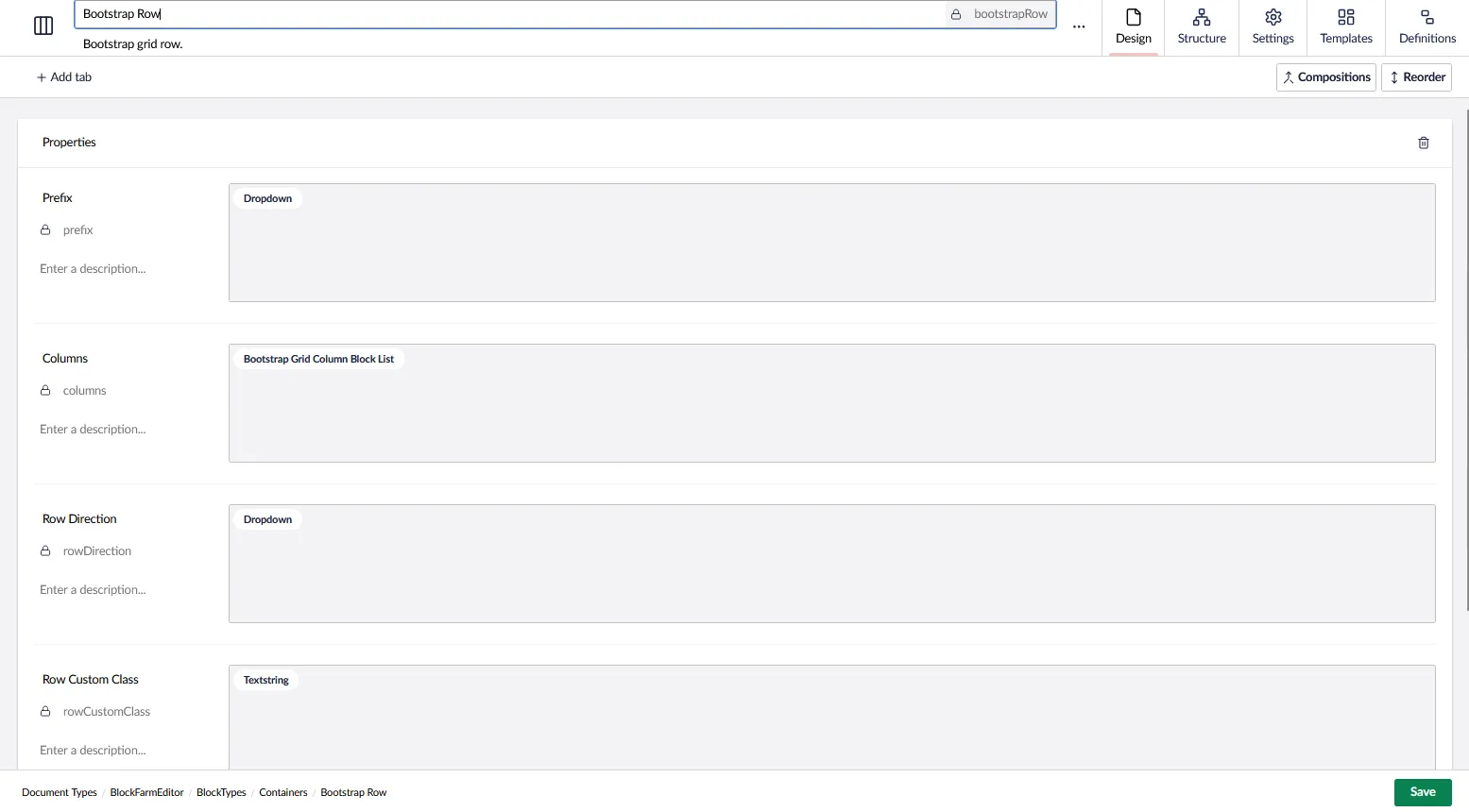
Creating a Bootstrap Grid.
The grid will be componsed of a block list for the columns and a few other fields as well.
The block list and an element type will be used to make the column creation dynamic.
Creating the column element type.
The column element type will be created with 4 fields.
-
First Property (Column Size) will be a dropdown with a configuration Bootstrap Column - Size Options It will contain the following options.
- Flexible (auto)
- 12 Column (100%)
- 11 Column (92%)
- 10 Column (83%)
- 9 Column (75%)
- 8 Column (66%)
- 7 Column (58%)
- 6 Column (50%)
- 5 Column (42%)
- 4 Column (33%)
- 3 Column (25%)
- 2 Column (16%)
- 1 Column (8%)
-
Second Property (Custom Class) will be a text string.
-
Third Property (Gutter Y) will be a dropdown with a configuration Bootstrap Column - Gutter Y
- Inherit
- No Gutter (gy-0)
- (gy-1)
- (gy-2)
- (gy-3)
- (gy-4)
- (gy-5)
-
Forth Property (Gutter X) will be a dropdown with a configuration Bootstrap Column - Gutter X
- Inherit
- No Gutter (gx-0)
- (gx-1)
- (gx-2)
- (gx-3)
- (gx-4)
- (gx-5)
Our element type is completed. Feel free to add more properties for the column as needed.
Next we create and register the Row Block
To do that we will create a partial view, create an element type and define the connection between the two.
Partial View
First we need the partial view.
@using BlockFarmEditor.Components.Blocks.BootstrapGrid
@model RowProperties

@{
    var SizeMappings = (string columnSize) => Model.Prefix + (columnSize switch
    {
        "12 Column (100%)" => "-12",
        "11 Column (92%)" => "-11",
        "10 Column (83%)" => "-10",
        "9 Column (75%)" => "-9",
        "8 Column (66%)" => "-8",
        "7 Column (58%)" => "-7",
        "6 Column (50%)" => "-6",
        "5 Column (42%)" => "-5",
        "4 Column (33%)" => "-4",
        "3 Column (25%)" => "-3",
        "2 Column (16%)" => "-2",
        "1 Column (8%)" => "-1",
        _ => ""
    });

    var GutterYMappings = (string gutterY) => gutterY switch
    {
        "No Gutter (gy-0)" => "gy-0",
        "(gy-1)" => "gy-1",
        "(gy-2)" => "gy-2",
        "(gy-3)" => "gy-3",
        "(gy-4)" => "gy-4",
        "(gy-5)" => "gy-5",
        _ => ""
    };

    var GutterXMappings = (string gutterX) => gutterX switch
    {
        "No Gutter (gx-0)" => "gx-0",
        "(gx-1)" => "gx-1",
        "(gx-2)" => "gx-2",
        "(gx-3)" => "gx-3",
        "(gx-4)" => "gx-4",
        "(gx-5)" => "gx-5",
        _ => ""
    };
}

<div class="row @Model.RowDirection @Model.RowCustomCss">
    @foreach (var column in Model.Columns)
    {
        dynamic item = column.Content;
        <div class="@SizeMappings(item.ColumnSize) @GutterYMappings(item.GutterY) @GutterXMappings(item.GutterX) @item.CustomClass">
            <block-area identifier="column-@(item.Key.ToString("N").Substring(0, 8))"></block-area>
        </div>
    }
</div>
Create the Block Element Type
Next we create the block element type.
(Optional) You may optionally fill the dropdown datatypes from the backend with dynamic content if you want. Otherwise, setup the dropdowns as you normally would with seperate configurations.
[assembly: BlockFarmEditorConfiguration("bootstrapRow", "prefix", typeof(RowPrefixConfig))]
[assembly: BlockFarmEditorConfiguration("bootstrapRow", "rowDirection", typeof(RowDirectionConfig))]

namespace MyNamespace;

public class RowPrefixConfig : IBlockFarmEditorConfig
{
    /// <summary>
    /// Returns a list of Bootstrap tab justification options for dropdowns.
    /// This is used for configuring the alignment of tabs in the Block Farm Editor.
    /// </summary>
    /// <returns></returns>
    public Task<IEnumerable<BlockFarmEditorConfigItem>> GetItems()
    {
        return
        Task.FromResult<IEnumerable<BlockFarmEditorConfigItem>>([
            new ()
            {
                Alias = "items",
                Value = new List<DropdownEditorConfigItem>() {
                new("Extra Small (xs)", "col"),
                new("Small (sm)", "col-sm"),
                new("Medium (md)", "col-md"),
                new("Large (lg)", "col-lg"),
                new("Extra Large (xl)", "col-xl"),
                new("Extra Extra Large (xxl)", "col-xxl")
                }
            },
            new ()
            {
                Alias = "multiple",
                Value = false
            }
        ]);
    }
}

public class RowDirectionConfig : IBlockFarmEditorConfig
{
    /// <summary>
    /// Returns a list of Bootstrap tab justification options for dropdowns.
    /// This is used for configuring the alignment of tabs in the Block Farm Editor.
    /// </summary>
    /// <returns></returns>
    public Task<IEnumerable<BlockFarmEditorConfigItem>> GetItems()
    {
        return
        Task.FromResult<IEnumerable<BlockFarmEditorConfigItem>>([
            new ()
            {
            Alias = "items",
            Value = new List<DropdownEditorConfigItem>() {
            new("Row", "flex-row"),
            new("Row Reverse", "flex-row-reverse"),
            new("Column", "flex-column"),
            new("Column Reverse", "flex-column-reverse")
            }
            },
            new ()
            {
            Alias = "multiple",
            Value = false
            }
        ]);
    }
}
Fill out Definition
Last step is to setup the definition hooking up the partial view to the block.
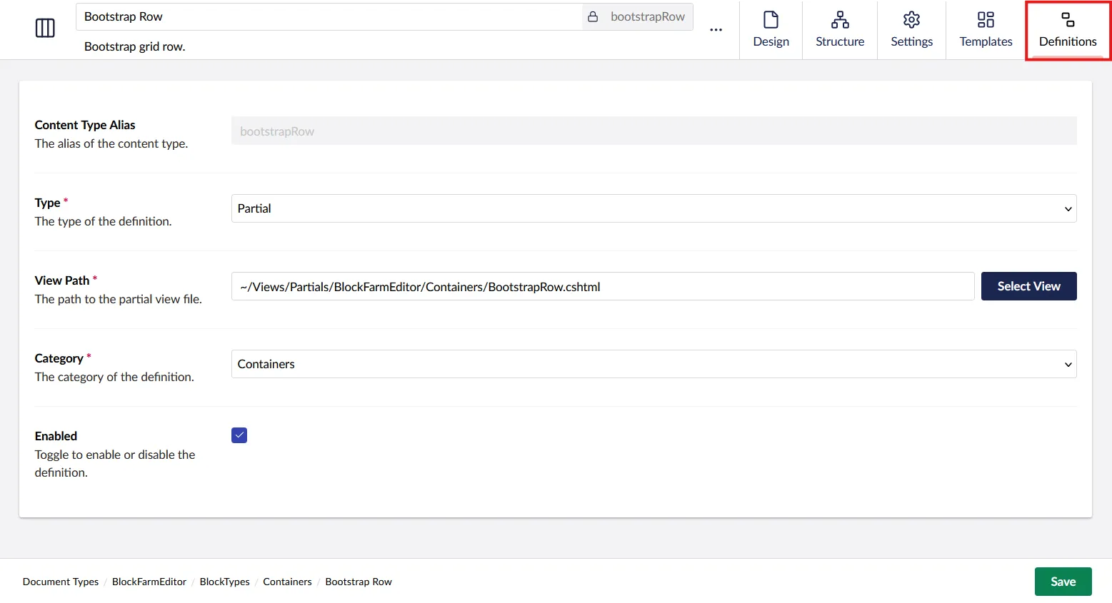
Your block is now ready for use.